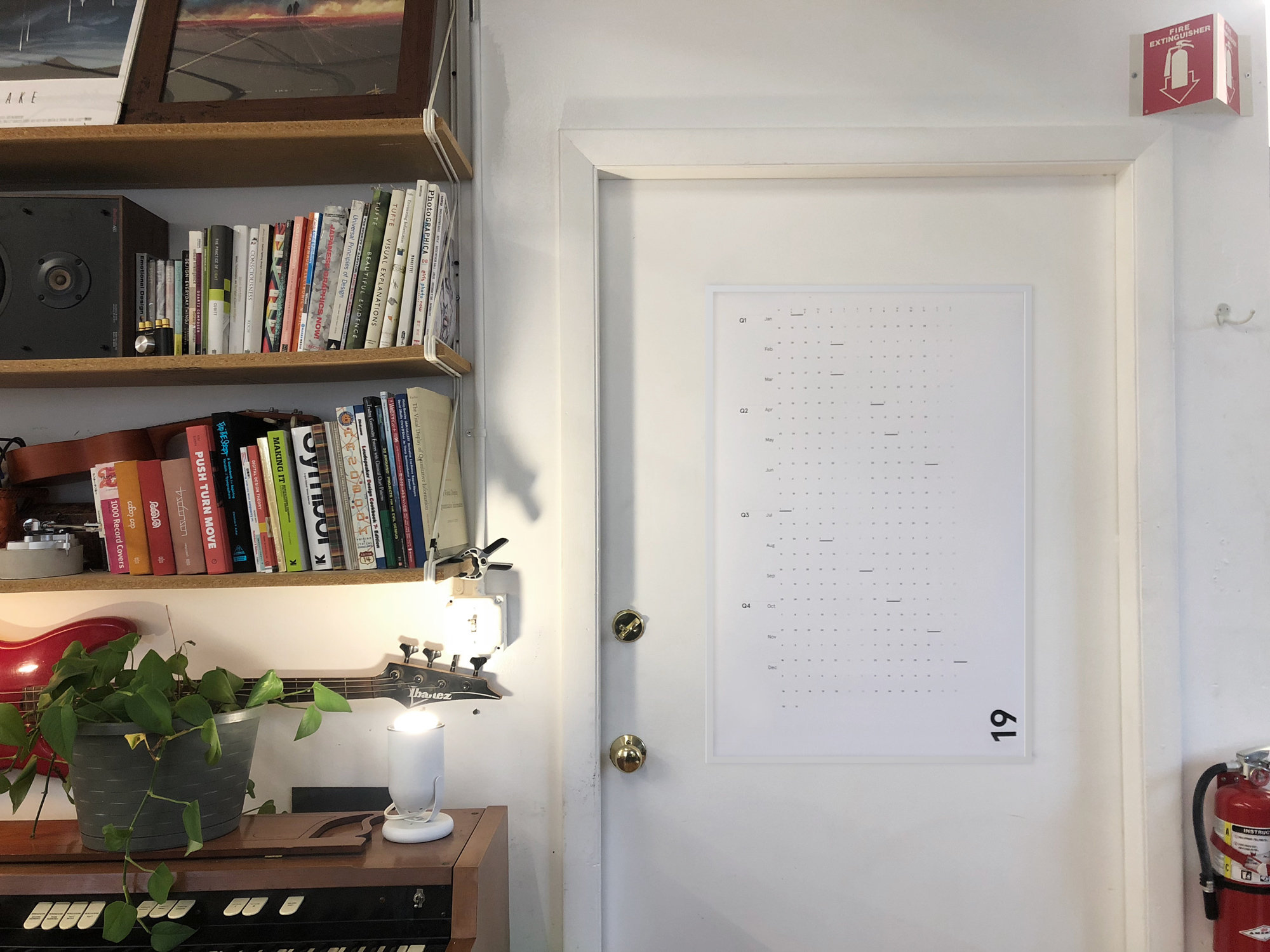
A Hyper Minimal Calendar for 2019
A Hyper Minimal Calendar for 2019
Off the heels of a successful Kickstarter, you can now get one of these lovely calendars here.
There are a couple hundred of these remaining, once they’re gone, see you in 2020!
Sold out - sign up to know about the next one below.
What’s the deal with this calendar?
Between being a dad, a freelance graphic designer, and a Kickstarter optimist, it became obvious to me that I really needed a wall calendar for the whole year where I could block chunks of time. A macro view of what is to come.
I looked around and the year calendars out there are mostly an eyesore. There's some wasted space each month on empty boxes. Functionally, it's useful for me to think in terms of weeks. Saturdays and Sundays belong together. I mulled all that over and designed my own! And then some friends said they want one too! And then why not everyone? So here we are.
The goals were to: make it beautiful, make it functional, and make it flexible.
Want to write a whole word across a week? Make a colored marker Gantt chart? Bullet journal? Washi tape?! This calendar gives just enough structure without getting in the way.
Flexible
Things like "Coffee this Wednesday at 10am" are always going to live on my phone. I like the reminders and the extra information. But how do I mark off sets of weeks for one project or another? What if I have a habit I'd like to "not break the chain" (like writing, or exercise).
And what if it were easy for multiple people to use it together?
Shared
Have a partner or roommates? Run a studio with multiple people where it would be useful to share general time planning? It would be so convenient to see if someone is going to a conference, planning an event, going on vacation, etc.
It could also be useful to block off an entire vertical column if someone has something to do on the same day of the week (like a class every Monday, or picking up the kids).
Design
The design of this calendar started out clean, but wasn't SO minimal. I already knew I didn't want to have bounding boxes per day like a regular calendar because I wanted to block off sets of days or weeks without having to write or draw across lines (it's designer obsessive compulsive :)
But then what? Well I started talking to the people around me. And when people proposed things like: drawing a picture, adding stickers, using washi tape to mark off time, and all sorts of other things I hadn't considered, it made sense to just get out of the way of all that.
The design of the calendar emphasizes weeks to make planning easier. Unlike regular calendars, no week gets broken up between two months. The weekend days are grouped together, and the first of the month is marked with a black bar.
And the black bars give it a nice musical rhythm.


